Table of Contents
If you have been following the industry of web design for a while now, you might have heard of something called “call to action” or otherwise known by the abbreviation “CTA”. Although many people have heard of this, they don’t know what it actually is and the importance of a CTA in your web design process.
Here, we will be looking at all things you need to know about CTA in web design. With that said, let’s dive right into it, shall we?
What is a call to action (CTA)?
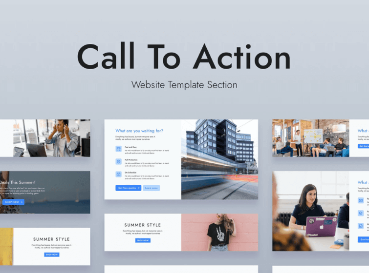
Call to action as the name suggest is an element on your website that persuades the visitors of the website to take a particular action that you as the website owner desire them to take.
This can be in the form of persuading the visitors to opt into a lead form, buy or download something on your website or even sign up for your email list.

Whatever it is that you desire your visitors to do on your website, and the precautions you take to get them to engage are known as a call to action.
For example, if you are running a service-based website with the main goal of getting leads, you can have a button with the title “contact for inquires” or a contact form itself to make your website visitors take that action you desire.
Why CTA is important for your website?
CTA is one of the most important elements in your website that you have to get absolutely right at this is the element on your website that single-handedly converts your website visitors into leads or customers.
The entire success of your website depends on your CTA. Inspirenix web design Sri Lanka referred to as not having a proper CTA is like opening a shop and not having a counter to check out products.
Must Read: 7 Common Website Design Mistakes You Must Avoid
Main Types of CTAs.
1. Lead generation Call to Actions.
This type of call to action is designed and placed for the sole purpose of lead generation. These types of call to action are mostly used by service-based business websites to capture a lead so that they can follow up on them and sell their service to them down the road.
2. Purchase intent Call To Action.
As the name suggests, this type of call to action pushes website visitors into making a purchase. This is most often done with a button with an offer to persuade the visitor to make the purchase instantly.
3. Email signup Call To Action.
This is also another type of lead generation call to action with a transaction of knowledge between you (the business owner) and the visitor (potential customer).
This is CTA is usually implemented by blog sites. Readers will be presented by an email signup form as the call to action where they will be emailed with the latest articles.
The main two elements in an effective CTA.
1. Target Market research.
Target market research is one of the most important elements when it comes to designing an effective call to action. This is because you have to design your website call to action in a way that is attractive to your target market so that they will be persuaded to engage with your business.
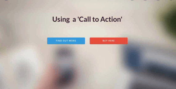
For example, if you have an eCommerce store targeting teenagers, having a call to action that is plain and boring will not get you as many conversions as you desire.
On the other hand, if you have a flashy and stylish call to action with some slang text that the youth use, then there will be a much higher conversion rate as you are speaking your target market’s “language”.
Must Read: Facebook Advertising Strategies to Boost your Sales
2. Placement of the Call to Action.
The placement of the CTA itself is very important as well. You as the business owner need to know when your website visitors are ready to take action, usually, it is at the bottom of the page if the content is educational as there is a much higher chance people will engage with your business after reading what you have on the website.
This is not always the case though. In some cases, the CTA has to be on the very top of a web page so that the visitors know what steps to take next in order to engage with your business.
For example, if you are selling a product via your website, a CTA of “Buy It Now” will be best placed at the top of the page next to the product than at the bottom where website visitors can quickly opt-in for the purchase.
On the other hand, if you need to get leads by offering educational or informational content, the CTA is best placed at the bottom of the page where people have finished reading your content and now know that you know what you are talking about and will trust your business more.
Conclusion
Now that you know all about Call To Action and why a Call To Action is important in your website design process, you will now convert more of your visitors and take your business to the next level and improve your website performance.


