Table of Contents
What do you look for in a website? You could be a pro web designer, or simply someone who appreciates a cool aesthetic, but chances are you’ve come across websites here and there that really stand out. There’s just something special about a site that isn’t merely an organized way to find products or information, but an experience that feels immersive and entertaining.
If you haven’t already come across that caliber of website, you’re about to – just keep reading! The websites below cover all kinds of purposes, from animation services to Dutch museums, but there’s one thing they have in common: they’re all impeccably designed.
-
Avoriaz 1800
This is the site for a French ski resort, and it’s pretty special. It isn’t the user-friendly layout that makes it stand out, or the stunning photography; it’s the panoramic 360-degree tours that you can take (virtually, of course) on the site.
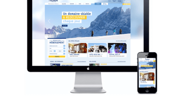
Choose between summer and winter tours, and check out both the ski areas and nearby apartments. Just like the ski resort itself, the experience is pretty breathtaking – especially considering you’re still just looking at a computer screen.
-
Fuse Animation
Showing by doing is what Fuse Animation’s website accomplishes. Users don’t have to search for their portfolio page to find out what the company can do; instead, visitors get to watch a video of 3-D photorealistic animations that plays automatically as soon as they hit the home page.
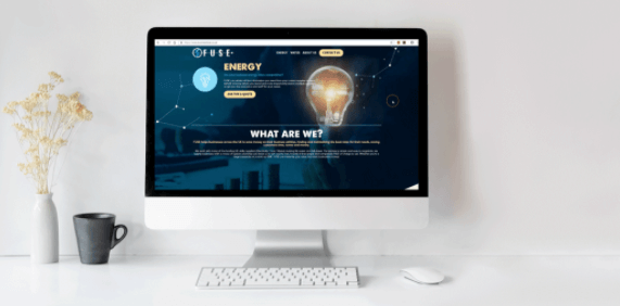
Exploring other parts of the site, created by website designers at WebCitz, reveals a strategic combination of photo elements and white space. While the page is rich with visual engagement, you’ll never feel overstimulated; there’s still plenty of room to breathe thanks to alternating pictures and text.
-
Buero112
This website tells the story of the digital design and branding agency Buero112. As in, it’s actually set up to tell a story, rather than simply communicate information.
A black-and-white theme predominates, but you’ll still find bits of color here and there in the form of a line of text, or maybe a picture. The video that starts playing as soon as you arrive communicates the brand’s message, and the custom pointer makes the experience feel more immersive.
-
Boosted
Color is good for more than just a nice website; some web designs get pretty clever with their use of color. Boosted, for instance, is mainly filled with whites and grays. The exceptions to the theme are the call-to-action buttons, which are vivid orange.
And here’s the clever part: the site sells skateboards which are predominantly gray, with orange wheels. Essentially, the web design mimics the products, which is genius.
-
Frans Hals Museum
This Dutch museum is way outside the norm for museum websites, but in the best way. The average museum website focuses on their exhibit pieces more than anything, but this website turns the user experience into a visual journey through museum displays, relevant information, and unique digital designs.
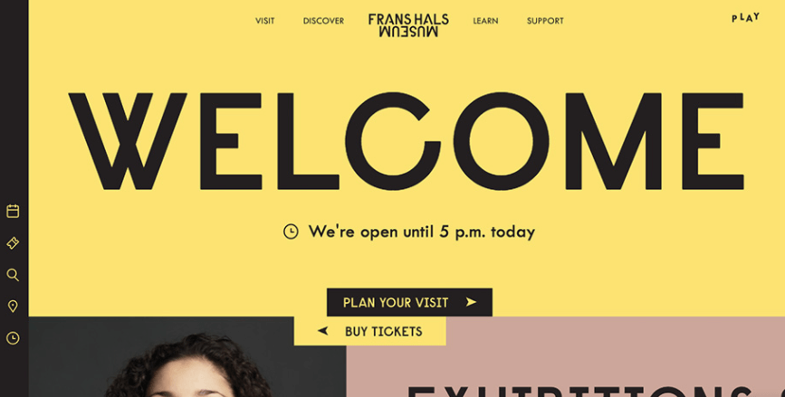
The most out-of-character thing you’ll notice about the site will probably be the color scheme, with nearly-pastel greens, pinks, and yellows predominating. There’s also just a bit of black (mainly in the form of lettering), which lends structure to the aesthetic.
-
Burger & Sauce
Yes, there can even be something special about a burger restaurant’s website – just look at Burger & Sauce. They take food photography to a whole new level. It isn’t just that the pictures are all that; visitors to the site feel like they’re being treated to something special by simply navigating through the pages. Something like 80% of people make decisions for their food orders based solely on pictures, and looking at this website, it’s easy to understand why.
-
Revols
Earbuds are pretty small, until you visit the Revols website; they use macro photography to turn their products into the focal points of each page. Looking at larger-than-life photos of earbuds makes them seem almost stately, and the oversized but simple text elements match the photographs. Tie everything together with a dark color scheme and a generally calming layout, and you have one sleek web design.
-
Homecult
Interior design websites are all about the visuals, so that’s important to get right. And you know that if Homecult made it onto this list, they did better than just “getting it right”. Even just the home page is a rich visual experience.
There are some very aesthetically pleasing photos, yes, but there are also some strong (but still subtle) linear elements that direct the user’s eyes to the next step. Even though you’re essentially being told how to use the site, the whole experience feels very intuitive, with a clean, refreshing look.
-
Yusuke Fukunaga
This is the only personal website on the list, but it fully deserves its place. It’s essentially just a basic portfolio site, where the web designer Yusuke Fukunaga showcases his previous work. Well, it would be a basic portfolio site if not for the mind-bending parallax effect, together with infinite scroll technology.
You can even move the page horizontally by directing the pointer to one side or the other of the screen. There are only three pages to the entire website, but they’re some of the most interesting pages you’ll see on the internet.
-
Beauvoir
Even considering the fact that they’re a creative agency, Beauvoir really went above and beyond with their website. It’s unconventional but in a genuinely engaging way. Users interested in learning more will start scrolling down the page, as one does, and suddenly discover that they’re scrolling horizontally.
That’s right – Beauvoir delineates one section of the home page not only with visual design elements but with horizontal scrolling. Then there are the gorgeous backgrounds, videos, etc. It isn’t just a visually pleasing site; it’s actually fun to use.
Most websites don’t exist just to provide an awesome user experience, but some of them do it anyway.
Even if you aren’t particularly interested in skateboards or interior design, these websites can still be a cool way to inspire your creativity.

